High Street
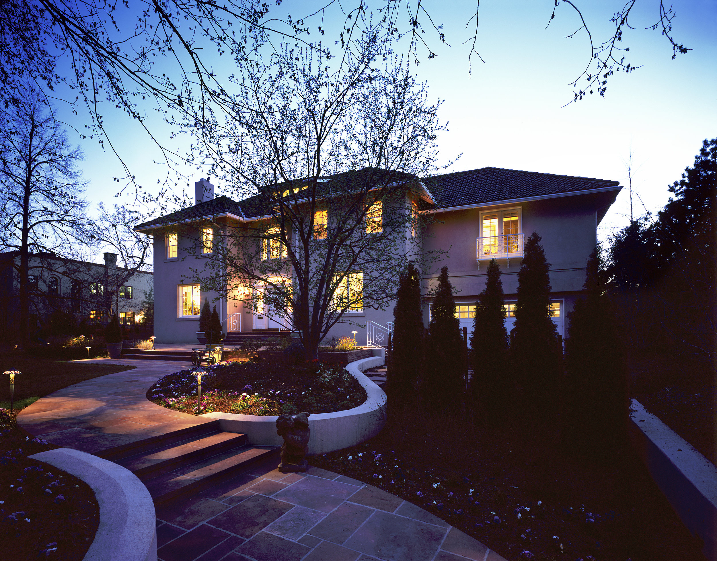
Classic Revival
- Cabinetry doesn’t need to be wall to wall or floor to ceiling to be effective.
- Antiques can provide a dramatic contrast to more modern materials.
- In older homes, keep modern recessed lighting to a minimum for an appropriate period feel, and make period style fixtures the focal points.
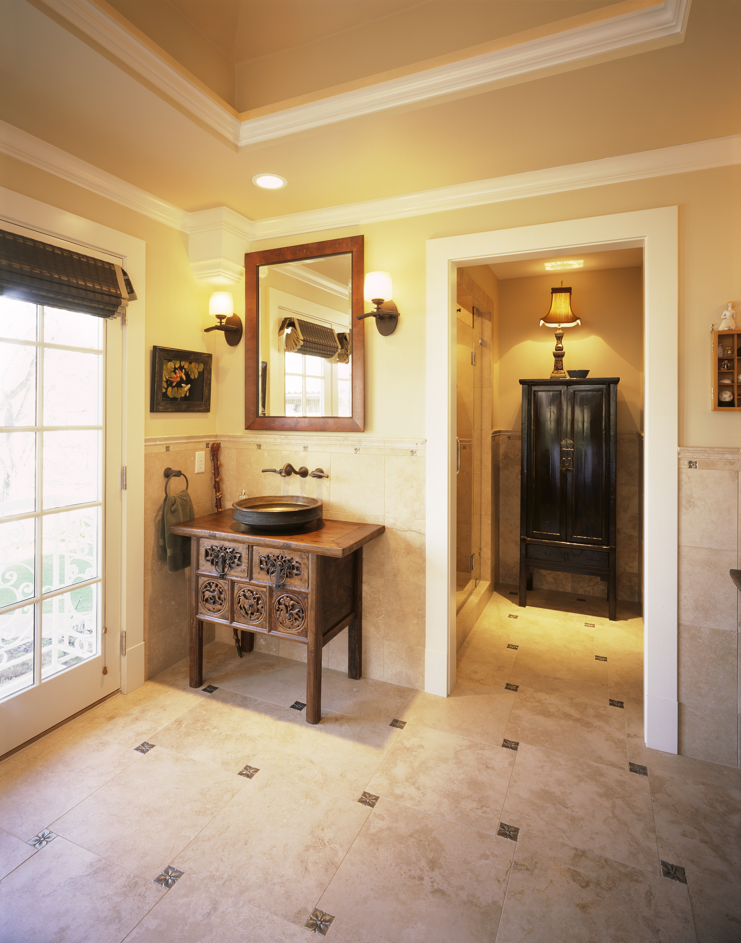
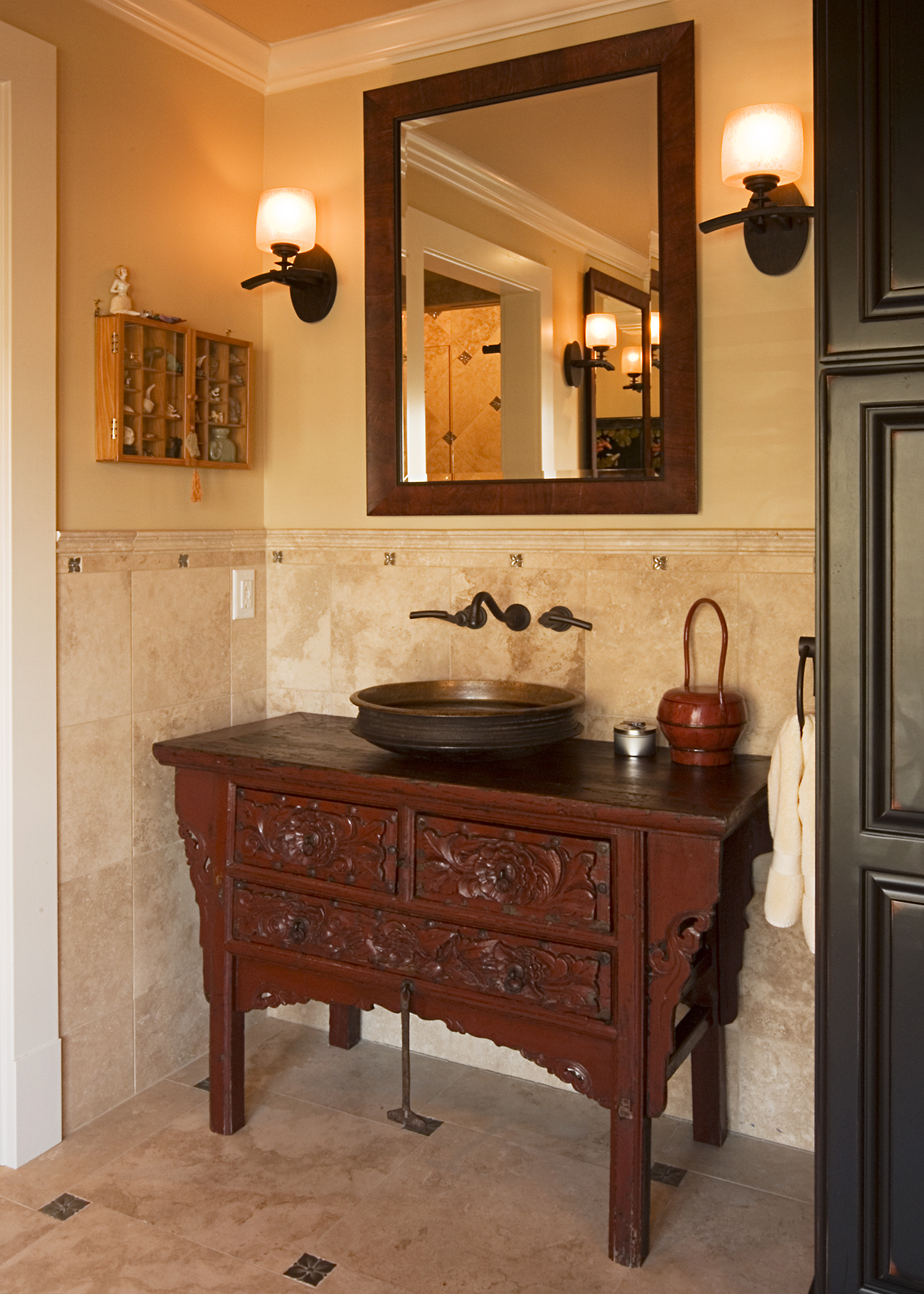
Forgoing the expected twin vanities, these homeowners chose separate vanities. Forgoing the expected built in cabinets, they shopped for antique chests to serve as his and her sink areas. Antique brass bowls from India were turned into vessel sinks. Finishing off the look were mirrors made with multiple picture frame profiles that combined to enhance the chests.
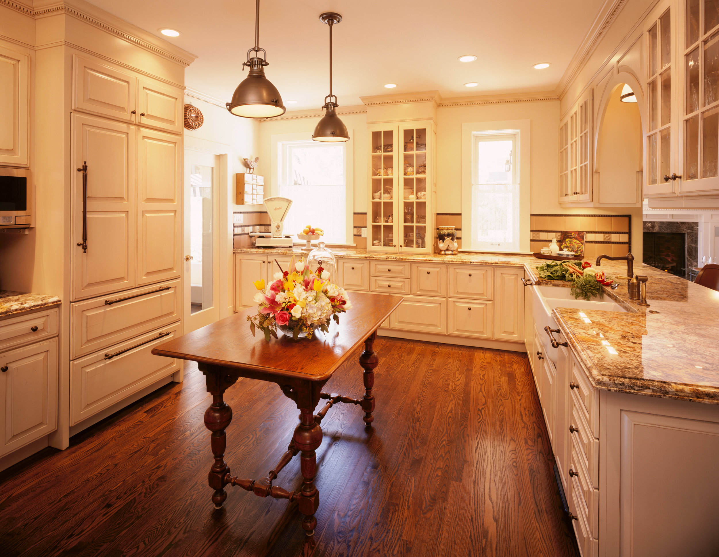
Although the kitchen was enlarged, it was still not generous enough for a full island. In this case, an antique table serves the purpose.
Cabinets are factory (Crystal), but put together in a customized fashion. The only truly custom cabinet is the curved cabinet over the sink area. Using factory cabinets helps keep costs down.
Working in an Historic District adds a level of complexity to the design approval process, but often yields a better product by working with guidelines.
Team included Mark Booren, contractor, and Greg Comstock, interior designer.
Laundry
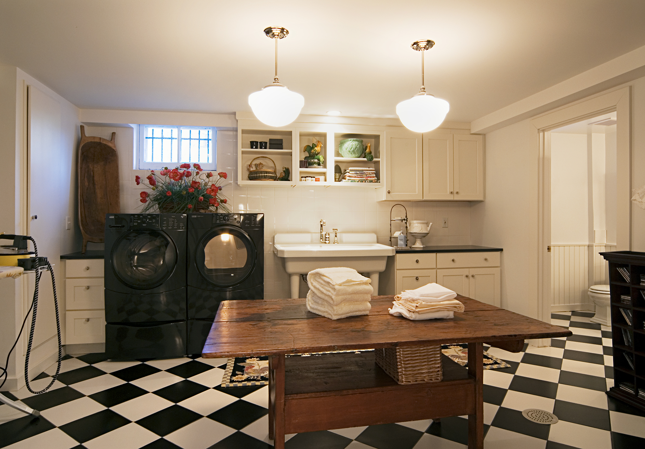
In a 1920’s Classic Revival home the laundry room was an afterthought, and the bath was antiquated and too small. Both were updated “back in time” to the period the home was built.
Simple white stock cabinets combine with modern front loading washer and dryer, and a retro laundry sink (Kohler) combine for a “semi-fitted” look. An antique table provides both folding and a focal point, with period “schoolhouse” lights over (Rejuvenation Fixture). Oversize black and white tiles laid on the bias provide visual punch in a classic color combination.
Kitchen
This 1920’s classic revival home in Denver’s Country Club neighborhood had been “modernized” in the 90’s with formica cabinetry that had nothing to do with the rest of the home. The kitchen was a bit dark, and cramped.
By eliminating an old back “servant stair” much needed space was added to the kitchen, as well as the master suite above. For more light , a second , smaller, window was cut into the old outside wall. New painted cabinetry is certainly a much more luxurious version of the white painted cabinets the home almost certainly had when built. Strongly patterned granite in warm colors are a modern, yet timeless touch.
Asian Bath
As part of a master suite addition on top of a 1920’s garage, the bath combines Chinese chests and Indian bowls as vessel sinks in an “unfitted” bath. Shower and toilet are in adjacent room, flanking the antique chest.
“Doug took all my wants, needs, and desires and molded them into the finest Victorian second story addition in the City of Denver! He is a very gentle man who was and is a delight to work with! He truly cares about the end product of both the building and the relationship with his clients.”

